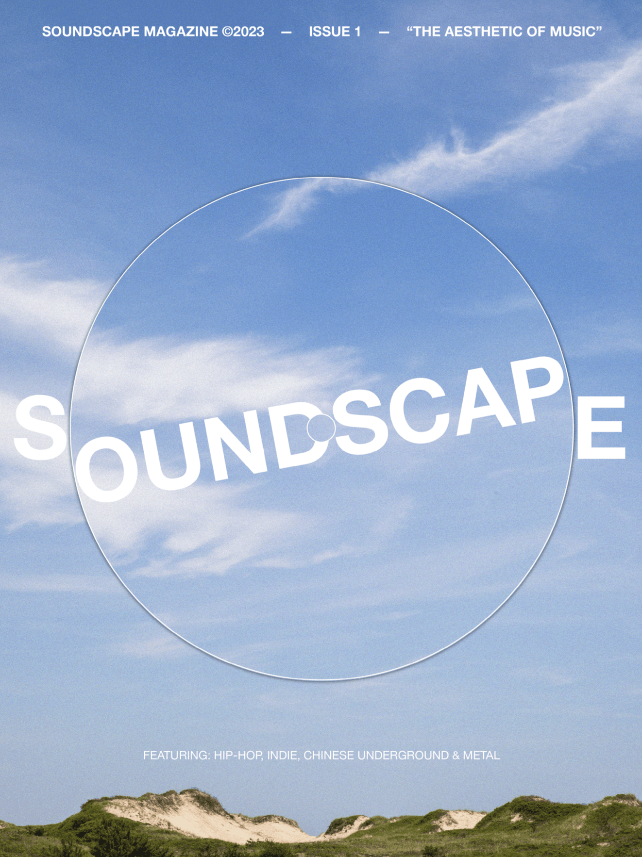
Soundscape Magazine
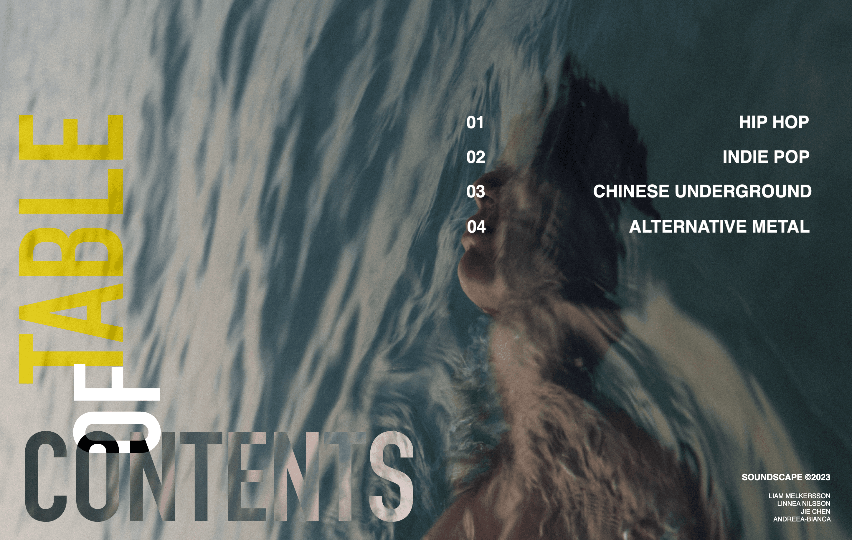
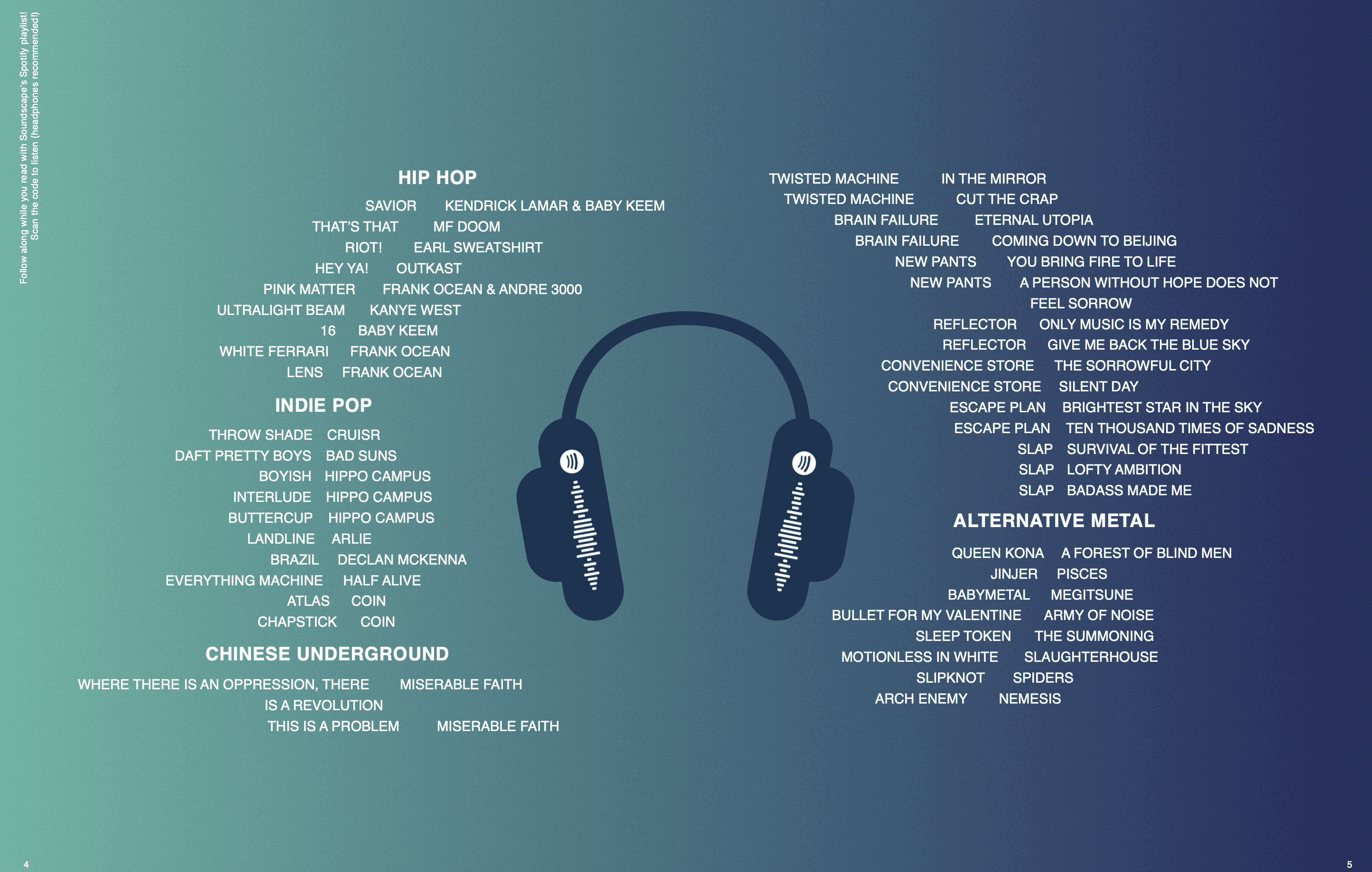
The magazine focuses on the aesthetics of music and explores how visual design can communicate the identity, mood, and character of different music genres. The final product was a cohesive magazine of 90 pages exported as a PDF.
Visual Design

Project Overview
The magazine focuses on the aesthetics of music and explores how visual design can communicate the identity, mood, and character of different music genres.
Our team followed a seven-stage design process: inspiration, identification, conceptualisation, exploration/refinement, definition/modelling, communication, and product. In the early stages, the group researched music genres, album covers, band imagery, documentaries, and previous magazine examples to develop ideas and define the project direction. We also established practical constraints such as time planning, a shared workflow, a consistent magazine format, readable typography, and print requirements.
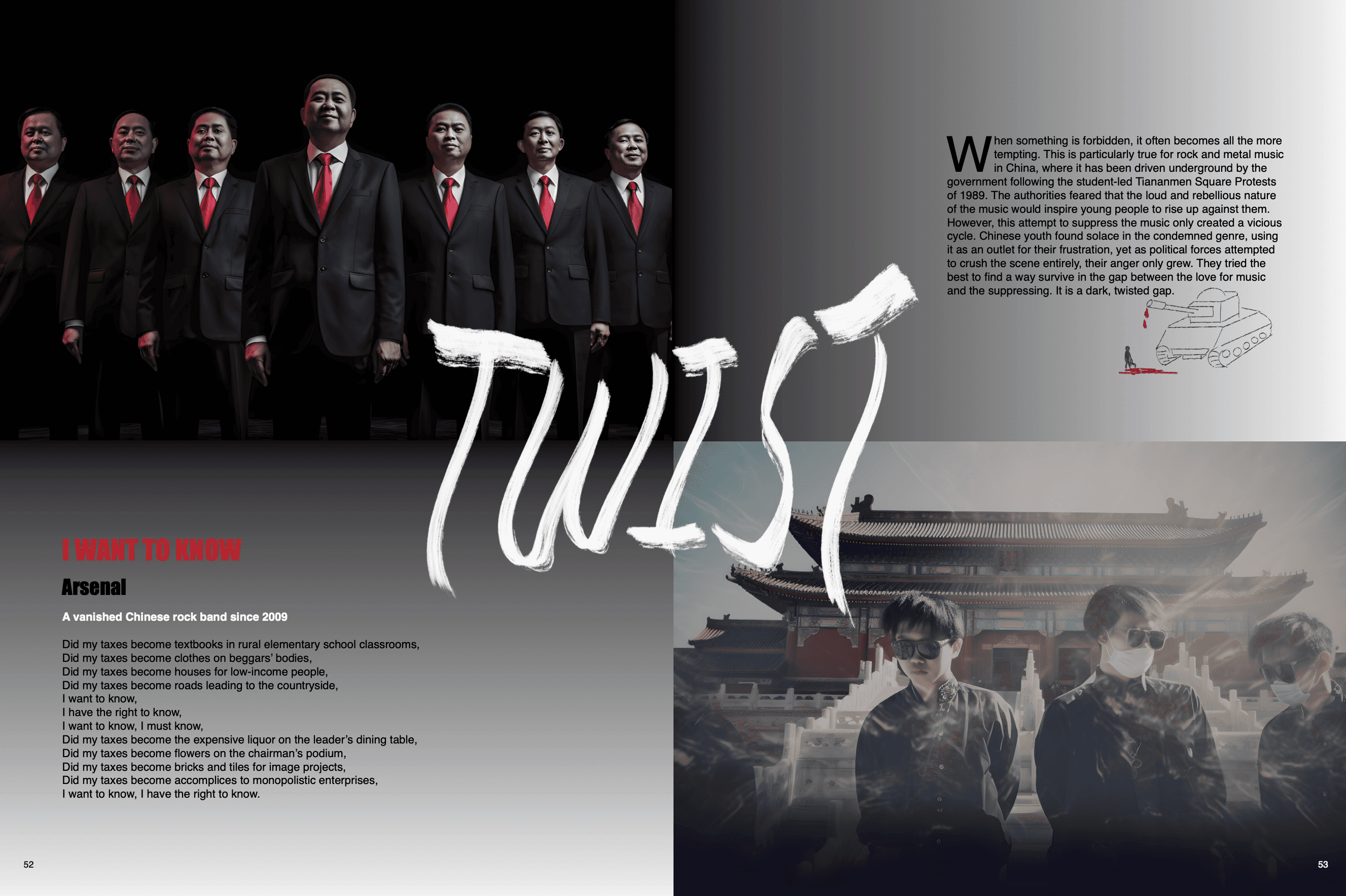
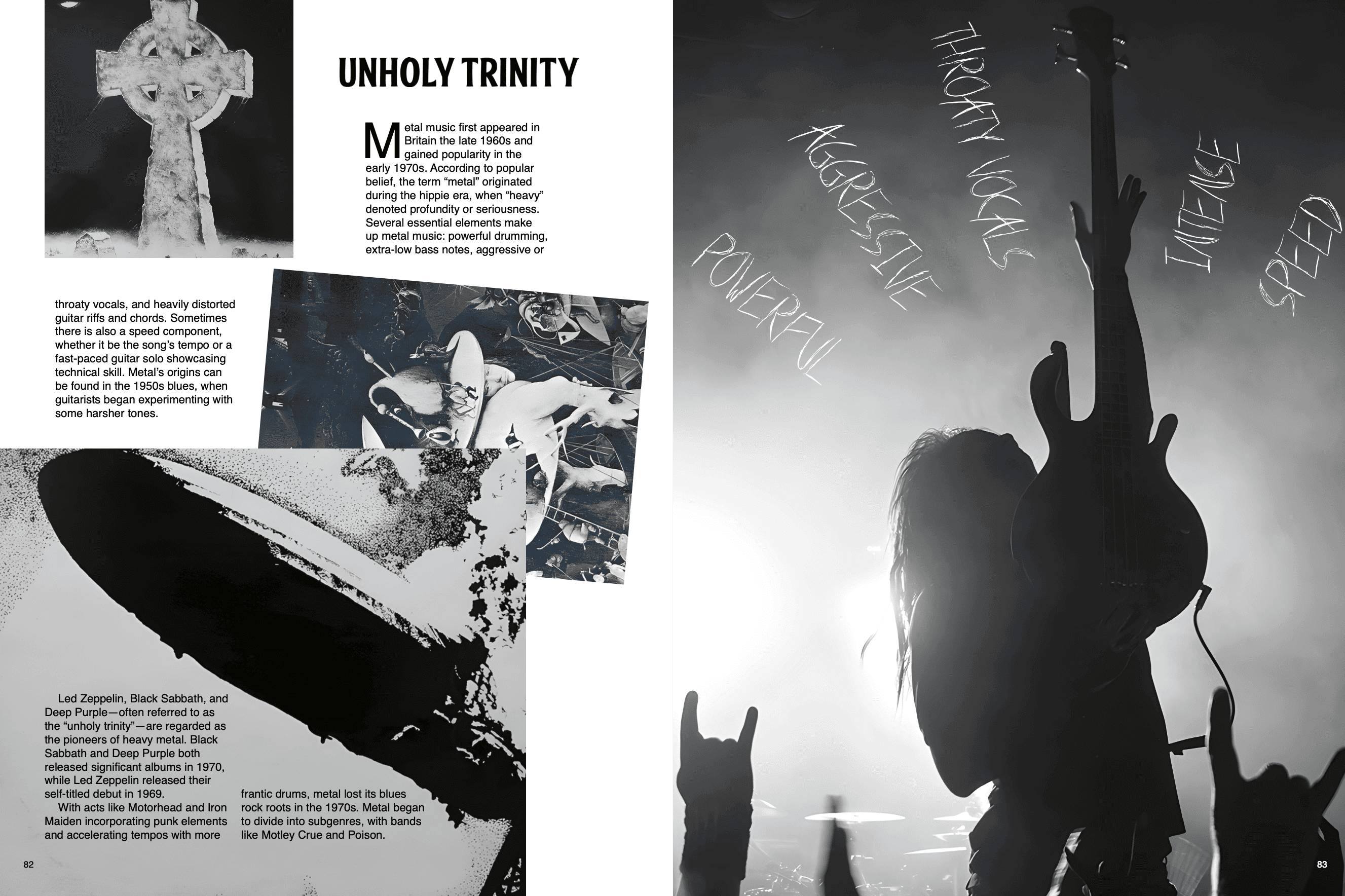
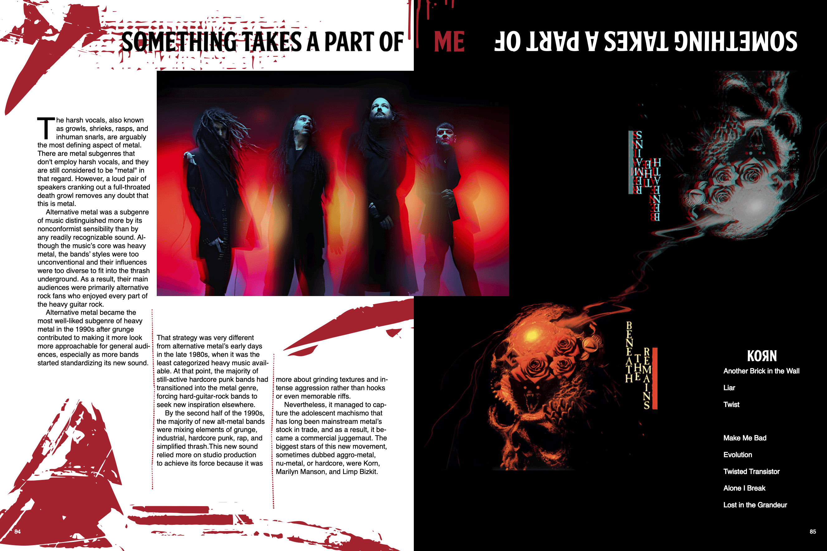
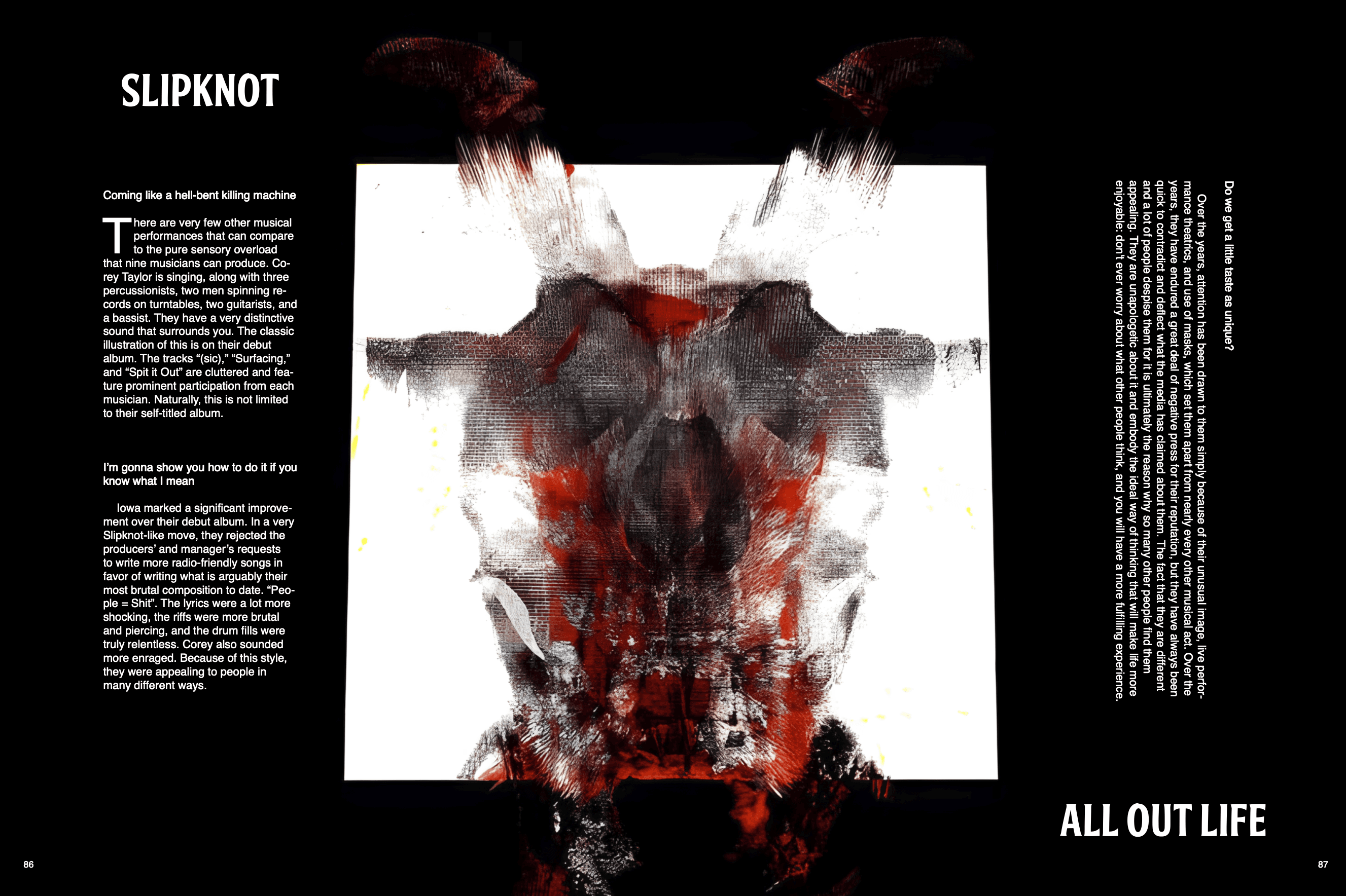
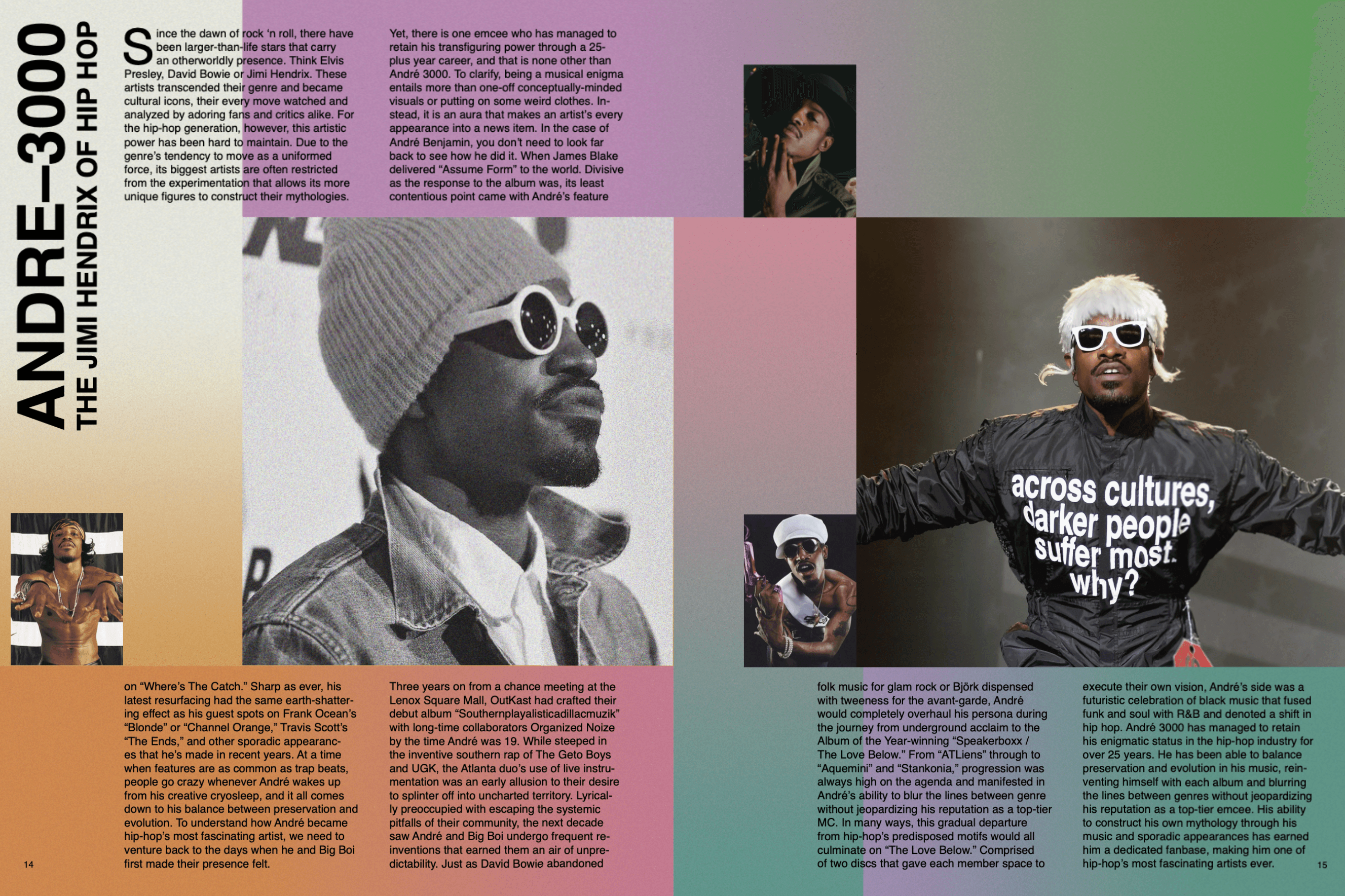
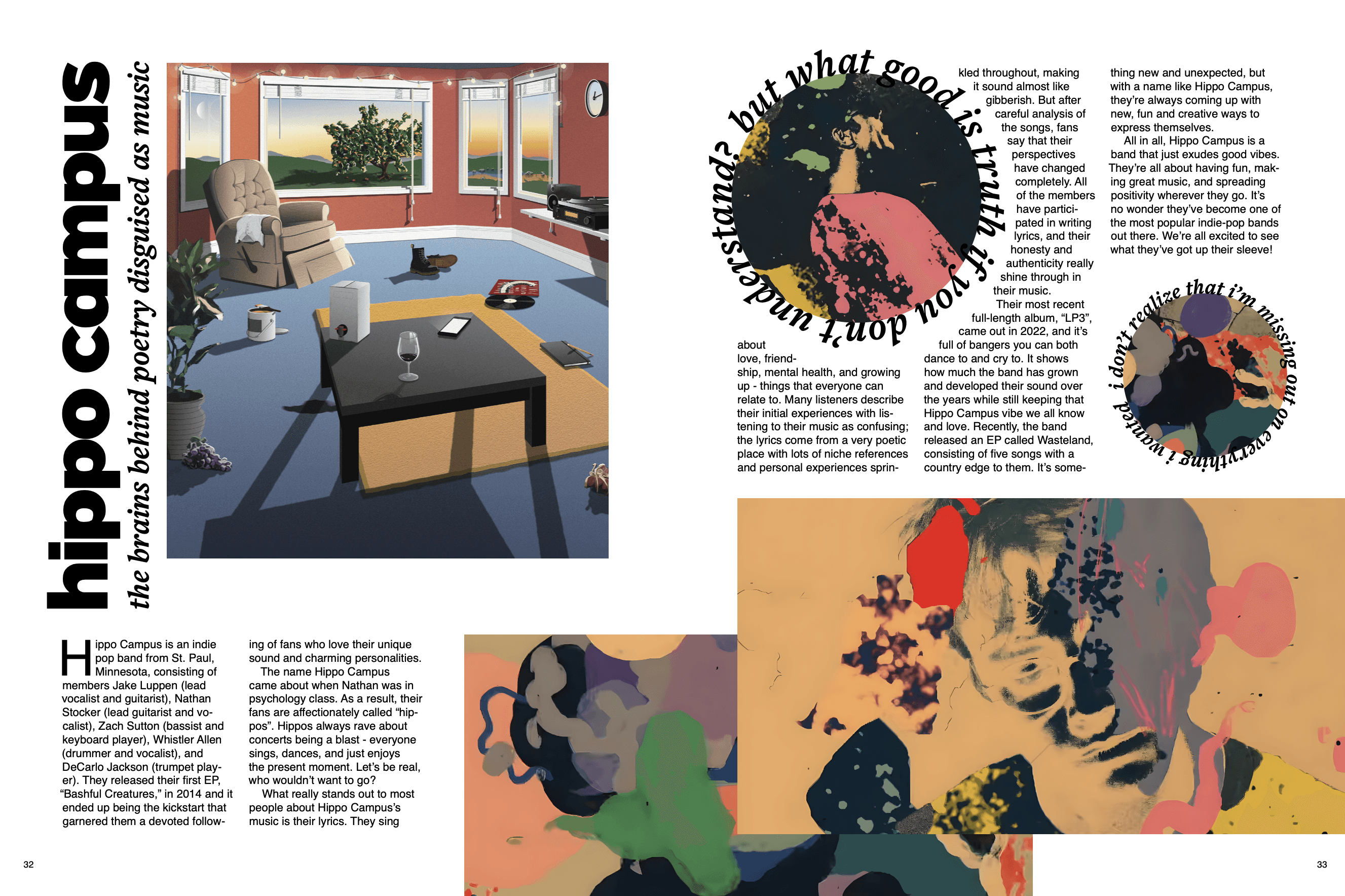
A major part of the design work was the use of strong visual elements to create atmosphere and meaning. We used colour theory, contrast, rhythm, negative space, and layout variation to shape the reading experience. Each genre section was designed with a distinct visual identity: hip hop was bold and minimal, indie pop was colourful and nostalgic, Chinese underground used black, white, and red for contrast, and alternative metal used chaotic imagery and a darker aesthetic. As a team, we also experimented with AI-generated images through MidJourney to expand our visual possibilities.
To move from ideas to final output, we produced low-fidelity sketches and practice layouts in InDesign. The final product was a cohesive magazine of 90 pages exported as a PDF, combining all members’ contributions into a visually engaging and consistent design.
Here you can find the link to the entire magazine: Soundscape Magazine.
Alternative Metal (my main responsibility)
Hip Hop
Indie Pop
Chinese Underground